Saturday, September 8, 2018

What a CTE Diploma Means to Me (redux)

     In NYC High Schools students are awarded one of two diplomas at graduation, a Regents diploma or an Advanced Regents diploma. Both require a certain amount of credits and/or regents passed to earn them and the requirements and benefits have many differences. Genrally, however, an Advanced diploma is better in the fact that it makes a student more attractive to colleges. Some select schools also give a CTE endorsement to a diploma. This endorsement is given when a student completes a CTE track and recognizes a student's skill in the industry their track was about. It essentially tells employers that a student is ready for a high level job in that industry. This endorsement also has its requirements but comes with many benefits as well.
   
     Starting with the requirements for the diplomas, an Advanced diploma takes more effort to obtain than a regular one. Credits  for graduation requirements are spread amongst 8 subjects and several elective classes for both. The requirements in common are earning 8 credits in ELA, 8 credits in Social Studies, 6 credits in Math, 6 credits in Science, 4 credits in PE, 1 credit in Health, and 2 credits in the Arts. The differences in credits are mainly in LOTE and electives. For a regular diploma 2 LOTE credits and 7 electives must be obtained, however, an Advanced diploma requires 6 LOTE and 3 electives.

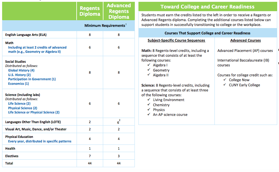
     In addition to differences in credits there are differences in regents you must pass. To earn a regular diploma a student needs to pass up to 5 regents tests: 4 must come from each of the 4 core subjects and the other must be another regents certified test. To earn an Advanced diploma more regents must be passed. Up to 9 regents tests must be passed: 1 from ELA, 3 from Math, 1 from Social Studies, 2 from Science, any amount of LOTE, and any other certified tests.

     The requirements for a CTE endorsement are very different from those of any Regents diploma. This is because To get a CTE endorsement you follow a CTE track and take courses not common in standard high schools. An unmentioned requirement is get a Regents/Advanced Regents diploma since you still need to graduate high school. Besides that the requirements are 7 CTE credits, 1 CFM credit, 1 industry certification exam, and a Meaningful enhanced WBL experience. These requirements are only filled on the CTE track and not a regular high schools track since the courses and exams needed are exclusive to CTE.

     The benefits of a CTE endorsement are plenty. One benefit is being able to attain an Advanced diploma without having to earn 6 LOTE and 3 elective credits. If the CTE track is fully completed a student only needs 2 LOTE and all electives are covered by the CTE track. Another benefit is certification exams. Cert. exams can count as a regents so to get to 9 regents for and Advanced diploma is easier. Regents that a student has failed can be replaced by a cert. exam. Only ELA can't be replaced. Getting and endorsement through Web Design has its unique benefits. Through Web Design you learn about creating websites. You can learn how to code in various coding languages and you get to learn how to use programs such as DreamWeaver to create sites. You also learn how to design webpages to make them look nice. You learn how to use Photoshop, Illustrator, and InDesign to do this, Finally, with the skills you learn in Web Design you can get a good paying job out of high school or become a freelancer.
   

Tuesday, August 21, 2018

WBL Seminar #2 Intro Into WordPress


     On 30 Apr 2018 I attended another Noble Desktop seminar for my CTE requirements. This seminar was about WordPress, an open source management system which allows the user to manage content on their website. This seminar gave and introduction through WordPress and gave a walkthrough of the UI and features of WordPress. Before the seminar all I knew about WordPress is that people use it to make blogs and websites as well as making it easy to edit them. After the seminar I had more knowledge about using WordPress's features to build my own websites.
This shot was bad since I was sick
     One of the first things I learned about WordPress were web hosting and running websites on web servers. With WordPress a .com domain is easy and free to use but limited. It only allows you to host your website on WordPress's server. The  .org domain is paid but more flexible and allows you to host your information to any web host you choose. After that I learned how you can create an edit new sites. Most of the work is done by logging into the admin. Once you're logged in you will have the option to create a new site and give it a name. This name can never be used by anyone ever again. Then you'll be able to change the look of your site by editing the headings, theme, content, and images. WordPress starts off with a limited amount of themes but you can add more through plugins or uploading your own themes. This is paid, however, and it allows you to personlize your website more. You can choose when you would like to make a post go public and you can view your posts in chronological order.
I look miserable since I was sick
     This information is important to me as a web designer because it provides me information about a platform I can use to create sites and make them visually appealing. While I can choose to code my site entirely from HTML/CSS and JS I can also make one fast by using WordPress. If  I'm creating a simple site I may not want to deal with coding it all from scratch, so I can just create one in WordPress and optimize it from there. WordPress allows me to easily customize the looks of the site through themes, theme plugins, and the ability to add my own themes. All in all, I see myself using WordPress to create a site where interactivity is something I won't be using too much but appearance and content are things I'll be tinkering the most.

Thursday, June 7, 2018

Final Project Portfolio


     Our last project for VD was about making a portfolio including all the work we've done from September onwards. This was a relatively simple project to do. The first thing we did was organize all our files into two folders, labs and projects. The PDFs and JPEGs for labs we did went into the lab folder and the same files for projects we did went into the projects folder, obviously. Next, every reflection journal we did about a lab and project were saved as PDFs and placed in the folder the reflection corresponded to. Finally, we made a read me file explaining what we learned throughout the year and the contents of the portfolio. The labs folder, projects folder, and read me were all put in one large folder, the VD Portfolio folder. The VD Portfolio folder was compressed as a zip file and submitted.
     That wasn't the only thing we did, however. We also made a PDF portfolio in Adobe Acrobat Pro. We used Acrobat previously to combine PDF files into one large file. This time we used Acrobat to make a PDF Portfolio, where files aren't necessarily combined into a single file but are integrated into a single unit. In Acrobat the integrated file names are displayed in a column on the side and when clicked on you can see said file. To create a PDF Portfolio the first thing we did in Acrobat was click create PDF under tools. We them selected multiple files and PDF portfolio. Then I added my files and organized my files into labs and projects, since PDF portfolios allow for folders unlike large files. Once all files were in I saved and submitted my PDF portfolio.

Tuesday, June 5, 2018

Project Newspaper


     Our 6th project made us work in groups to make newspapers/magazines. These newspapers followed the layout out regular newspapers, including things such as bylines, deckers, mailing panels, and more. We also chose a topic for our newspaper. My group chose to write about politics. Next, we assigned roles and planned like in the previous project. This time we were more definitive about roles  and we had a rigid plan, so there was no role switching or time wasted. After the assignment of roles we each wrote an article about our topic. I chose to write about gerrymandering. We then had our peers review our article and revised them accordingly. The final article was transferred to InDesign with pull quotes and pictures. Our individual files were combined into one entire newspaper to be the skeleton of the newspaper.
     My role in my group was manager and head editor. As the manager of my group I made sure that my group members were on task as well as myself. If they got stuck my job was to help figure out their problem and find a solution. I oversaw the designer’s work and would point out if something didn’t work, something was missing, or what things worked that the designer should repeat. As head editor I revised my group’s article a second time and edited parts of their article for them to make them enjoyable to read. I also fixed grammar issues and spelling errors.
     Overall, this was a great way to apply what I learned from the last project in a new project in terms of working with teams. In the last project lack of good planning and undefined roles led to setbacks and delays, making it difficult to meet the deadline. In this project I feel I was able to correct that mistake and get work done efficiently. I also feel that I was able to use my organizational and management skills well. I was able to monitor the progress of my team as well as know when my teammates were having trouble. I was able to make sure my team stuck to the plan and got everything done on time.

Project Yearbook

     Yearbooks are publications that are meant to give information or highlight the current/previous year. Our 5th project for VD dealt with making mini yearbooks. This yearbook was meant to display our experience in our first year of Web Design (aka the entire year of VD). This was the first project done in teams and the first thing we did after meeting with our teams was assign roles. There was to be a leader, designer, researcher, and photographer. I was the researcher, which meant I gather information about yearbook structure, student info, school info, etc. However, later on I took on the roles of researcher, designer, and co-leader.
     After getting roles assigned we researched parts of a yearbook and took a look a various designs and ideas. Then we set a theme for our yearbook. Since we couldn't agree on one we choose the theme mosaic since we would try and combine multiple themes and styles into one. Planning time frames was next. We set small deadlines for completing specific parts of the yearbook which would eventually become the ultimate goal, completion of the yearbook itself.
     As the researcher I went online and found multiple sample yearbooks to follow as a guide structure wise and design inspiration. If there was a technical skill dealing with Photoshop, Illustrator, or InDesign my teammates didn't know as researcher I looked up videos abut the skill and showed it to my team. Additionally, I looked up pictures online if the photographer wasn't able to take a picture of something and I looked up information about the staff of our school to include in our yearbook. As the designer I was experimenting with different ideas on how to present something. I would take ideas from my teammates or go online for backgrounds of pages, presentation of pictures, and fonts. I also made sure the sections of the yearbook followed a logical order chronologically.
     This project was a great learning for me as a web designer in terms of working in a team. Our team faced a major challenge of getting work done on time which is due to the poor lack of planning and management in the team. People in our team would always switch role and wouldn't know what they're doing. If our team was more thorough when planning this wouldn't have happened and we could've met our deadline less stressful. So I learned having a plan, that is thorough but flexible, is key to group projects. I plan on using what I learned in this project in the future if I get a job dealing with working in teams. Since in the workplace getting a task done on time matters with quality matters it will be important that there is a well defined plan with roles that fit the skills of the teammates. That way we can ensure that the job gets done right and it will show our employer professionalism.
   

Monday, May 28, 2018

WBL Seminar #1 Search Engine Optimiztion

     On 4 Apr 2018 I attended a Noble Desktop seminar for my CTE requirements. This seminar was about Search Engine Optimization (SEO). SEO is about increasing the amount of traffic your website gets by making it appear high on the list of returns by a search engine. Before the seminar all I knew about SEO was that visual design is important in making your website look attractive and gaining traffic. After the seminar I learned a lot more about SEO. First of all, there are multiple types of results a search engine like Google can yield. There are paid ads which usually come as the first result if you see one. This is obviously because the company behind the ad paid far it to be the top result. Next are the organic results. The order these appear on in the results is based on relevancy and quality, with the most relevant and higher quality appearing higher on the list than those of a lower relevancy and quality. Finally, there is Google My Business. These results are mainly for local business such as restaurants and depend on reviews and citations.

     Two qualities that attracts audience into a website are expertise and authority. Experience and quality are the two main things one need to show to prove expertise in their business. Authority is shown through positive reputation, recommendations, professional association, and popularity. Trust is another thing that attracts people to a website. An 'About Us' page in your website can build trust with the audience by making it easy for them to understand what your business is about. Contact information builds trust by providing your audience a means to reach you if they have any questions or concerns. It lets them know you're there when they're confused. A privacy policy and SSL certificate might be the most important in regards to the website itself. Customers don't like it if particular information about themselves is recorded and shared. A privacy policy is a way of telling your customers they are free to do whatever they want and their information will not be shared. This builds a lot of trust and keeps them coming back. An SSL certificate basically says your website is protected and safe from hacking. This certificate is particularly be useful for sites where commerce takes place. Customers who give their credit card information to a site don't want it to be stolen by hackers. If the customer sees HTTPS (which means the site has the SSL certificate) they know the site is secure and are more likely to trust and buy on it. Lastly, there are keywords. A website attracts a particular audience and certain keywords can help attract that audience. If a websites is selling clothes it should use key words relating to the clothing its selling in its content and URLs. Tools such as Google Keyword Planner and Keyword Anywhere help businesses figure what keywords to use to be relevant.
     This information is important to me as a web designer because I need to make attractive websites. Not only through looks alone but through other aspects. In my content I must include things that help build trust between my customers and my business. Not only is it about selling stuff but selling it in a welcoming environment online. I now know about the SSL certification and know I must keep my site safe from hacker. And finally, key words will be crucial in how my website ranks in the search results. It's no longer about visual design only but about trust, safety, and relevancy.

Tuesday, May 22, 2018

Mock Interview/ 6th WBL Workshop

     At our 5th WBL workshop students were given mock interviews. These interviews were for a made up organization and tested our skills at giving interviews. The three important questions we needed to answer were "Tell me about yourself", "Why should I hire you?", and "What do you want to do in this company?". These questions tested how we branded ourselves to our interviewer and our skills to convince our employer to hire us.
Image result for interview     During the interview my ability to answer the questions with detail was a strength. I was able to answer 'yes or no' questions with more than a yes or no. I was able to give detailed and in depth responses to the questions asked to me, giving more reasons for my employer to hire me and avoiding awkward silence. I also believe I was able to assert myself with my posture and facial expression throughout the interview. However, one of my weaknesses was my attire. I was wearing casual attire which made me look unprofessional. I also had a lack of preparation before the interview which made it so that I froze on certain questions. Finally, my vocabulary was very basic and some things I said would’ve sounded better with better word choice.
     In the future I can improve by making myself look professional. This means not only wearing business casual but fixing my hair and washing my face. I can also use more body language which will make me seem more human and not a stiff robot. I can do research about the job I am applying for so if I am asked specific questions about the company or skills I don’t freeze. Finally, I can expand my vocabulary by reading more and using new words in sentences that may be used to answer interview questions.

Wednesday, April 11, 2018

Interactive Brochure Project Reflection

     Last time we left off we made a brochure in InDesign. In this project we used the same brochure to create an interactive brochure using InDesign. An interactive brochure is different from a regular brochure since it has animations and includes things the user can interact with such as hyperlinks. The way we added these interactive feature was to go to Window/Interactive and explore the many interactive features, but we primarily worked with Animation and Hyperlink under the Interative submenu. My brochure included shapes that were the background to white text and my brochure had a primarily white background besides those shapes. So I wanted to add an animation which would initially hide the shade and then reveal it, revealing the text hidden in the white background in the process. Exploring through the animations I found that Fade In, Fly from Top/Bottom/Left/Right, and Appear had the effect I was looking for. The shapes were bullet like so I chose Fly from and the direction chosen was in accordance to the direction the bullet was facing. My brochure included pictures which I envisioned would slowly appear after all the text would appear. The animation I chose for this effect was Appear, very fittingly. I changed the duration to be longer since it would slow down the time it took for the pictures to appear. Last but not least was the front page. The title was meant to have a dramatic effect I increased how dramatic it was through animation. My title consisted of three lines and I used Fly in from top to load the title. However, I changed the duration so it would be more faster, almost like if it slamed down. I didn't want my name to have this effect so I chose Fade In, since it would load subtly. Now were the hyperlinks which were very easy. I included a sources section which had links. I made those links clickable by highlighting them, right clicking, and choosing hyperlink from URL. To end it off I added a page transition (flip) and that was that.

Monday, April 9, 2018

My Fourth WBL Workshop

     Our Fourth WBL Workshop was about writing resumes and getting hired for jobs and internships. A resume is how a candidate advertises themselves to potential employers and can get candidates an interview with their potential employers. Employers use resumes to prescreen candidates, looking for the required skills and abilities needed for the job. Resumes compete with each other so it must include lot of valuable information in order to come out on top. Skills, accomplishments, abilities, past work/school activities, and educations are valuable pieces of information that can help a candidate compete with others. Besides having a name, address, and phone number a resume must be error free, have a clean/professional format, and have brief/well organized content. The content itself must list include information, such as skills and abilities, that make a candidate look good for a specific position. If someone is applying to be a teacher they must list their degrees in teacher, experience teaching, etc. and not other information like experience working at a deli. Overall, a resume is a personal brand  that advertises one's self to employers.

Sunday, April 8, 2018

Power Skills Synopsis

     So, in conclusion Power Skills are very important in getting and keeping a job. This course prepares me for a job by teaching me all the non-technical skills I need to prove myself worthy in the workspace. Having a network with the right people help you gain information about finding a job. It can also connect you to people who are important in getting you a certain position in a job. Showing positivity and enthusiasm will be key for me in gaining and keeping job. It can also help me advance and get promotions. Another key thing to keeping and being good at a job is communication. Communicating well means that you'll be able to receive and convey information well. This is important in helping work flow well and eliminating possibility of misunderstandings which can hinder work. It is also important in Team Work. By using good communication skills in team work I can help get more work done in an efficient manner. It is important to work in teams since it helps make big daunting tasks easier to deal with. Critical Thinking and Problem Solving is another thing that helps work flow smoothly. Many times during work a problem will arise which may seem like it is stopping all progress of your work but if I'm able to analyze the problem objectively and then find a solution based on my analysis it can help my work progress and it will make me more productive. Productivity shows Professionalism. In addition to being productive being on time and conducting myself in a responsible and accountable manner with integrity and excellence also helps me show I'm professional. Being professional helps me be a more valuable employee and boosts my job security. Power Skills will help me be a better worker, make you successful in life, and will help pay the bills.

Power Skills Interview Skills

     Choice C in the interview was a fail safe which failed at being a fail safe. Perhaps on a multiple choice test choice C may be the one to go for questions you're stuck on (research proves otherwise) but in an interview it is one of the worst fail safes. There are no choices, just responses that must be made, so choice C doesn't work (it doesn't exist in an interview). The interview that choice C person gave was pretty sub par compared to the following interview. Choice C person struggled to answer a lot of the questions and reverted to choice C while the following interviewee answered many of the questions properly and when she didn't something she asked proper questions and gave proper responses. Choice C person didn't look like she was enthusiastic about the job while the following interviewee showed a lot of passion about the position. Additionally, the following interviewee seemed like she knew what sh was talking about through her answers. In this case the applicant I would like to be is the following interviewee. She has the skills needed for the positions and is more confident, all important things needed for not only getting a job but keeping it. Additionally she was passionate and showing you're passion for a position is more likely to get you that position.

Power Skills Networking

     Currently I am networking with my friends and teachers mainly to gain information about school related subjects. Besides verbally networking with them (in person) I also use Jupiter Ed, texting, Skype, and Discord to stay in touch with the people I network with (the latter 3 being used exclusively for my friends) since these platforms are heavily used by the people I network so it is convenient. I know that I am networking with the right people since the information I always receive from them is valuable to my school work. My teachers always keep me informed about certain assignments or plans and my teacher for VD always keeps the class informed about opportunities like internships or community service which help us complete some requirements for the class. Additionally networking with my teachers keep me in touch with them so if I need a recommendation for an internship I can go to them. My friends always remind me and keep me informed about schoolwork and the opportunities for our VD course. Also if they learn something outside of school which may be beneficial to me they let me know and I do the same for them. All in all, these networks do more good for me than harm so I know that these are the right people I'm networking with.

Saturday, April 7, 2018

Power Skills Communication

     Communication skills are important skills to have regardless of if you're working a job or not. Communication is the basis of being able to have conversations with others and the circulation of ideas. It is important that one can communicate well (written or verbally) in order to have productive conversations and get their ideas out. In real life (outside of jobs) we communicate verbally with others for small things like asking for an item, conversing with friends, etc. If one couldn't have such verbal conversations life would be difficult since something as little as asking someone what the weather is like would be a hassle. If good communication is not established in the workplace the work experience will also be difficult. In an environment such as the New York Stock Exchange communication is crucial since every second is the difference between a gain or loss. In that workplace people are constantly communicating, filling orders for their clients. If verbal miscommunication occurs it could mean a great loss or an epic missed opportunity for a client. It is easy to see why communication is important in the NYSE and the same applies to other workplaces. Good communication helps work flow smoothly and efficiently and reduces the chance for confusion and delay to occur. It is this reason why it is important to be able to communicate well.

Power Skills Critical Thinking and Problem Solving

     Critical Thinking and Problem Solving are very valuable assets of an employee. They can also be very valuable to a web designer. A web designer will constantly face problems with building their website and so must always be able to asses the problem and find a solution. For example, the typography/layout of the website will have to be constantly assessed to make it optimal as well as the actual content of the website. A website must look good and have good content but  a problem that may arise while trying to do so is the load time of the website. At a technical level (coding) trying to make the website look good and have good content may be too much and will cause the load time of the site to suffer, which may be bad for impatient viewers. In this case a good web designer will asses the problem at a technical level and will find a solution. Maybe by changing the organization, cutting content, or moving excess content to other pages a good web designer will find a way through. All in all, being able to asses and solve problems helps you get out of sticky situations. Having these skills will help you make progress when the going gets tough and will make you a more productive worker since you're able to make progress and get more done.

Power Skills Professionalism

     Professionalism is something expected out of employees in the workspace. However, it can also be presented in school. Professionalism involves conducting yourself in a responsible and accountable manner with excellence and integrity. One of the basic ways to show professionalism in the school environment is the be on time to class. It makes your teacher happy and you don't miss out on anything important. Another basic way of showing professionalism is wearing proper clothing. Some schools require that you wear a specific uniform while others just have a dress code to follow. Whatever it is just dress in accordance to your school's policy. 
     Besides the basics you need to be responsible and accountable. If there is an assignment it is your responsibility to get it done on time. If the teacher gives you a task (put up the bulletin board, deliver papers to the office, etc.) you need to be responsible in completing it. If you're a leader of a group you must be accountable, or able to justify your decisions on how you lead and organize the group, and you must communicate well with your teammates so you can get the job done. If you are done with an assignment or task and you know that you have more work to do you can be professional by doing what's next without being told to do so. This shows you're taking initiative as well as showing you're a productive student. More ways to show productivity is concentrating and your current work and not getting distracted in conversations with your friends. Managing your time efficiently also shows you're a productive student. Being professional in school not only makes you a good student but it gets you ready to show some of the same qualities in the work place.

Power Skills Teamwork

     The main skill needed to work with others as a cohesive team for common goal is communication. Communication is crucial to a team because it gets ideas and messages around. It is primarily through communication that you have discussions with your team on how to achieve a goal. You must have good communications skills for many reasons. One is to ensure you do not mislead any of your teammates. If you are not clear with how you communicate there will be misunderstandings in your team which will cause confusion and delay which does not look good. Another reason is to ensure members of your team don't have any difficulties personally. Communicating with your teammates not only lets you get the job done but it helps you learn more about the people you're working with personally. Knowing your teammates personally can ensure that it is more comfortable to work with them. It also ensures you will be able to identify any discomfort or conflict your teammate(s) may have even if they don't express it verbally.
     Organization/coordination is another skill important to teamwork. A team is assigned a task which must be broken down in order for it to be done efficiently. Certain people are better in certain technical skills than others. You must be able to identify these strengths and weaknesses of yourself and others so you can assign tasks accordingly. This ensures that there is little struggle to get a task done and you are more likely to get the task at large done faster this way with your team. Good organization makes it less likely there is misunderstanding in your team so work can flow more smoothly.

Tuesday, March 27, 2018

CTESS Interview Thank You Note

Recently I have been interviewed for an internship. The very last thing I did was send a thank you note. Below is what I sent.

Dear Ms. Olivo,
          
      Please forward this message to Ms. L, one of the interviewers on 3/26/18 in ITHS. Thank you for taking the time to interview me. It was a great experience for me to know how job interviews play out in the real world. Going back to the internship, you should hire me because I have a fair amount of skills using Adobe software as well as Word and Powerpoint as I stated in the interview. Additionally, I would be a great in the workspace due to my organization skills and problem solving skills. Again, thank you for interviewing me and I hope to hear back from you.

                                                                                                                   Sincerely,
                                                                                                                   Jawad Rahman

Thursday, March 15, 2018

Project Brochure Reflection

     The theme of this project was respect for all. Respect for all week was going on in our school so for this project we choose a topic we thought was a problem going on in the world and wrote a brochure about it. We started by drafting a layout of a brochure on paper. No real content went into this draft but we were figuring out what we would put and where we would put them. It was during this process the major framework of my brochure as developed. On the cover was going to go a cover photo with large lettering for the title. Inside on the second page would go my introduction. After my introduction was my first story which extended on to the next page. On the page next to the second page would also be my data which would extend on to the page after that and finally another story. The back panel was planned to have all my sources listed and on the third page on the back would be my solutions page. Then we planned out the content we were going to put in to those sections of our brochure. These were specific fact in specific sections of our brochure. This is where we chose a topic to write about and then researched facts for our sections. I decided to write about climate change which changed a lot of my draft. I had renamed sections so they fit in line with the approach of how I would present the material. The first story became an explanation of the greenhouse effect, the data section became the causes of climate change, and the third story was broken up into 2 sections about the impact of climate change. The last section on the back became a message to the reader about what they should do to help. The choosing of my topic and the facts I researched forced me to change a lot of the draft since the first draft didn't help me present my material in a logical fashion.
     Then we were up to the part of creating something in InDesign. We transferred the draft of our layout to InDesign and put in our content we planned. We obviously used the text tool heavily to do this. Many of us, however, had typed our content in a word document and were copying and pasting back into InDesign. We would frequently end up with overset text which was easily fixable by linking text fames but for some sections that was not possible. This is where I discovered the story editor which allowed me to see all the text in the frame and told me where the overset was. I was also able to edit my text from the story editor to make scetions that were too long fit within the space alloted. There was also the matter of creating a background. For this heavy use of the rectangle tool and the associated tools was required. Some of the text did not look good aginst the background color so the color of the text needed to be tweaked frequently. The typography was tweaked a lot for spacial issues, these issues almost always being that the text did not fit. So font size, leading, and tracking were some of the things that needed to be tweaked to conseve space. To inset images and data tables we used text wrap so the text wouldn't overlap the image and vice versa. Finally, the printing part. After we printed our brochures for the first time there was an obvious problem with folding. The spacing between the three panels was wrong and the brochure did not fold properly, some of the content was creased. So it was back to InDesign where we learned about gutter and margins/bleed. Gutter and bleed are areas the printer need to grab on to which means nothing is printed in those areas. Taking into consideration the gutter/bleed we fixed the spacing of our brochure and called it a project.

Friday, March 2, 2018

CTE EXPO Reflection

     
I'm in the middle
     Recently we've had our first CTE Expo for our VD course. A CTE Expo is an event where students interested in joining a CTE Academy meet and talk to students already in the academy to gain information about that specific academy. The objective is to help students be more informed about the academy. This is to ensure when the student makes the decision about which academy they want to join their decision is informed. This also increases the chances that students will want to join said academy. There were many things done in preparation for the expo. Last time we did a project it was making logos. What we did after was make 9 business cards with 3 specific layouts and 3 of our best logos used in every version of the layout (3 cards share the same layout but have a different logo). Those business cards were then but on a tri fold poster board along with some writing to be our presentation for the expo. These cards were meant to show what we learned throughout the first six months of VD visually. We also practiced how we would talk to the students. Things like handshakes, appearance, and what we would say to them are things we practiced. I looked back at my notes to refresh my mind about what the course it self was about and memorized specific concepts so I can mention them. I didn't want to explain my project rather the course itself and what we would do and have the board as a visual example of what we do. 

     During the actual event we did what we prepared for. We greeted the students as practiced and we mostly stayed on script to what we planned to say to the students, MOSTLY. Some of the presenters, including myslef, needed to switch to plan B. I practiced handshakes and greeting but no student would come to me. So I went searching for students and used a strategy to bring them to my board. I would tell them intersting things about the academy as well as an overview of the course and used their interest to see more to bring them to my board. How well did that go, it only worked on 2 students. Most students didn't even want to talk to me as they had already seen other presentations. I realized I wasn't a big attention grabber but others were. Others also did not give some information that I knew. So plan C was initiated. I would wait for the attention grabbers to get the attention of the students. Then after they were done giving their information I jumped in and gave additional information. This included info about career opportunities and challenges we faced. It didn't bring students to my board but I could still say that I informed students. 
     Many things went well during the expo. The content of our presentation was one thing that went well. The presenters were able to keep the students interested. They may've decided not to join our academy our any academy long before the expo but by their facial expression I knew what we were saying was still worth their time. As a matter of fact we were able to change the opinions of some of the students that already decided. The presenters themselves was another aspect that went well. The presenters were all well behaved and respected the students. The attire of all the presenters was good, everyone looked nice. The presenters were able to show that they knew what they were doing in the academy and were able to answer questions thrown at them. Not all went well and things can be improved. The layout of the expo was very packed. It made it difficult to navigate and search for students. It was also difficult for some of the students to figure out where they can find out certain info. So the next layout should be easily navigable and the students should easily be able to figure out where to get specific info. The projects we did for the expo also need improvements. We did a lot of writing for the students to read but none of them were interested in reading them. Since the students were more interested in seeing than reading we could've used the time we spent writing on things of interest the students would've enjoyed seeing. Some of the freshmen also acted poorly. Some of them were rude and insulted the presenters. They would play on their phones while we were talking to them. Next time the freshmen could be told to act better so they don't decide he expo is a free period and no rules apply.
     My overall feeling about the expo is that it was a success. The presenters were able to successfully give meaningful information about the academy and keep the interest of the students. We were able to convince some students to join our academy and we helped reinforce the decision of the students who decided to join our academy before the expo. The environment was professional just like our academy. There were a few nicks here and there but overall it was a success. 


Tuesday, January 16, 2018

Lab 15 Reflection

     In our 15th lab for our VD course we were yet again introduced to a new program, Adobe Indesign. Indesign is very similar to Illustrator except Indesign is used more to design magazines and posters rather than make art.
     The only new tool we used in this lab was the Convert Direction Tool, associated with the Pen tool which we also used. Other tools used were the Rectangle Tool and Text Tool This lab was more foucused on text editing. Not neccisarily changing the shape of text by creating outlines but editing fonts and sizes of bodies of text and their placemant and positioning.

     The first thing we did was a review from Illustrator. We were to create a black banana shape using 2 curve and corner points. To make the points we used the Pen tool and to curve 2 of the points we used the Convert Direction tool. The color was changed to black in the Properties bar.
     After that review we wrapped fully justified text around a rectangle. First we put some text in a text box and in the properties bar selected the fully justify option. Next we created a rectangle using the Rectngle Tool. We opened the Text Wrap panel from Window in the Menu Bar and with the rectangle selected we selected the option to wrap the text and set the offset on all sides to be 0.09 in. Then we moved our text on top of our the rectangle and

watched as the text wrapped around it.
     Our next task was to create 2 paragraphs with each having a header. We needed to use Paragraph Styles to define Headers from the Body paragraphs. We did this by opening the Paragrapgh Styles panel (Window/Styles/Paragraph Styles). Then we created a new style called Header copy and changed how we wanted the headers to look by altering some details in Basic Character Formats. The headers were selected and this style was applied. The same was done for the body paragraphs.
     The last task was to make a series of lines using '123 fido' with some slight altercations each line. The first 3 lines had ligatures turned on for them, meaning the letters were closer together/combined making them easier to read. The 123 in the first line was made lowercase and an infinity glyph was put at the end from Window/Tables and Types/Glyphs. The 123 in the second line was made to have tabular lining. This was done by checking tabular lining from Window/Types and Tables/Character/Open Type/Tabular lining. From the same panel the 123 in the third line was made to have proportional lining. The symbols in the second and third line were selected from the same glyph panel from before. The fourth line has the word 'fido' tracked out and ligature was turned off.
     These skills are important to a web designer because these skills broaden the scope of what a wed designer can design. Indesign is almost like MS Word on steriods (still a gross oversimplification) so if a web designer seeks to make media which is primarily text based they can use Indesign. Indesign has alot of flexibility with text so using Indesign to design primarily text based media can help a web designer enhance their work instead of working under the limitations of the other programs.

Monday, January 15, 2018

Project Logo Reflection

     We are currently working on our third project for our VD class. So far we have designed our logos in Adobe Illustrator and combined them into a single PDF file. We started off by sketching our logos onto paper. We did 3 drafts for 3 types of logo style; iconic, composite, and wordmark; making a total of 9 logos. Once we did our sketch we transferred the logos into Illustrator. The way that we transferred our logos required us use the skills we garnered from previous labs using Illustrator. So we used skills such as drawing lines, curving lines, and editing vector shapes and text.
     Once we were done transferring our logos we separated the logos into individual PDF files. The way we did this way copy and paste each individual logo into an Illustrator file and resized the Artboard to best match that of the logo. Each Illustrator file containg only one logo was saved as a PDF and a PDF file containg all 3 drafts of a single logo type was saved as a PDF, making a total of 12 PDF files. We were then introduced to a new program called Adobe Acrobat. In Acrobat we went to File/Combine into single PDF. Then we selected all the PDF files to be combined into a single PDF file. Once the combing was done we were done with a portion of the total work in our logo project. Stay tuned for the next part next time on Visual Design Jornal Z.

Tuesday, January 9, 2018

My Third WBL Workshop

     Our third WBL workshop was about working jobs as a teen. We learned about some ways teens can get injured on their job. The most common injuries came from slips, falls, burns, and cuts. We also learned that working as a teen can be stressful. One of the reasons why is that much is expected from you from your employers, managers, etc. Another reason is that teens are inexperienced and don't know how to do a lot of things required of them in the workplace. We were told to combat this we should ask questions. If we don't know how to do something it is better to ask how to do it rather than risk doing it wrong or injuring yourself doing it.
     We also learned about safety rules and rights. We learned that as teen we are not allowed to work with machinery. We learned that there are a certian amount of hours we are allowed to work and past a certian time if we're still working there must be an adult present. We also learned that if we get injured on the job it is within our right to file a claim. If we don't feel comfortable doing something at our job and our employer is not listening we can tell an adult in school. Overall this workshop taught us various aspects of working a job as a teen.

Thursday, January 4, 2018

Lab 14 Reflection

     Many logos are wordmark logos. This means that the logos are only composed of text and many times these logos are a custom font. The font used to make the logo exists but it has been altered. In our 14th lab we learned how to alter text in Adobe Illustrator.
     The three tools we used in this lab were the type tool, type on a path tool, and the direct selection tool. The type tool types out letters. Similarly the type on a path tool types letters on a path, think of a path as a line that you created. The direct selection tool works like the the normal selection tool except you can use it to select individual points of an object.
     The first thing we needed to do was create a word with 30 pt san serif bold text, scaled 200% horizontally and tracked to -100 vertically. Let me get a few terms out of the way. Serif and san serif are classifications of type. Serifs are little flags or serifs at the ends of letters, such as in Times New Roman. Serif text will have these serifs while san serif will not. Tracking is spacing between all letters in a word. Tracking can be increased to space out letters or decreased to bring
them closer together. Horizontal and vertical scaling is simply increasing the size of a letter or letters along the x or y axis respectively. To set all of these specifications I first typed out the word. Next I went to the Character panel. Here I am able to change these things to fit the specifications to fit these conditions. Once they were changed I ended up with the picture above. But I also needed to create my own specifications with another word. So I made a word with 60 pt serif regualer text, scaled vertically 200% and tracked to 100. The result is the bottom picture.
      The next task was to create the word top and kern only two of the letters, and change its color to grey. Let me get some terminology out of the way again. Kerning is the spacing between individual letter. Unlike tracking, kerning foucuses on space between specific letters rather than all letters. Here you can see there is more space between the T and o than usual. The color of the text was change to grey by changing it in the properties bar. When then needed to create our own specifications again. I kerned all letters but I made sure the B and first o were more spaced out along
with the second o and m being more spaced out as well. Then I made sure the space between the 'otto' part of the word was closer together. Once that was done the fill color was changed back to black.
     After that we needed to create two 60 pt letters which we needed to convert into outlines, change the shape of one letter, turn off the fill, and have a black stroke. The way I changed the shape of a letter was first making the outline of the shape. The way I did this was go to Type in the menu bar and go to create outlines, having the letter selected while doing this. Then I used the direct selection tool to select individual anchor points on the letter itself, holding down shift to select multiple at once. Then I draged them in one direction changing the shape of the letter. Once this was done I created outlines of the
other shape, placed them in a specific way, turned off their fill, and turned on their stroke. We again needed to make our own version. I made three letters, repeated the exact same steps as before in a previous way but in a different way, and resulted with this.
     We then made a copy of the outlines and combined them into one shape. This was done using the pathfinder panel. To access this panel I went to Window/Pathfinder. Then I selected an appropraite option to combine the letters. I ended up with this:
 I again did the same thing for my version and ended up with the picture below the previous.
     It was finally time to type on a path. Using the Pen tool I made a wavy path. Then I selected the type on a path tool, a tool associated with the type tool. Then I put the cursor on my path and when the cursor looked like a normal 'I' but with a slash going through it I clicked on the pathe and started typing. The result was this:


There was unappealing spacing between a few letters which I fix by kerning them. We needed to make our own version so I made a slighlty curved path and did the same thing I did previously to type on it.
     These skills are important to a web designer because text is an important part of designing a website. Things like spacing between letters and shape of letters can mean the difference between a fine work of a website or a web page with words vomitted on to it. Your audience will be reading a lot on your site so if you know these skills you can make it easier for your audience to read your site. It overall makes your website more appealing.