Thursday, December 28, 2017

Lab 13 Reflection

     In our 13 lab for our VD course we were learning new skills in Illustrator. We were discovering new ways to curve lines, make curved vertexes, and scale objects. We were basically expanding the newly learned knowledge from the previous lab.
     There was really only one new tool we used in this lab and it was the anchor point tool. What it does is let you reshape and edit a path by letting you select a path and adding/subtracting points. It is useful in making lines curved. Other tools we learned but didn't necessarily use are the scale tool, shear tool, and reflect tool. The scale tool lets you scale objects, making them bigger or smaller, from an origin point if you so choose to use a origin point. The shear tool slants an object, like turning a square into a parallelogram. The reflect tool will reflect an object.
     The first thing we did was create two mountain points with the sides of equal length and only 5 points. To get the equal length the grid was turned on from View in the menu bar. Then using the grid 5 anchor points were set using the pen tool making sure the segments in between were of equal length.
     The next thing we needed to do was turn out mountains into hills and make a bow. The first thing we did was copy the original mountains and using the anchor point tool the peaks of the mountains were made curvy. Then a copy of the hills was made and reflected from Object/Transform such that the peaks faced the opposite direction of were they were pointing originally. It was placed directly under the original hills but wasn't connected to them yet. Then using the pen tool the two sets of hills were connected and the fill color was set to grey in the properties bar.

     After that we recreated the Paralympic Games logo using 3 shapes and one circle. To the left is my best recreation. I used 3 rectangles of relatively equal size and used the curvature to warp the rectangles at certain points to get the best result.
     Our next task was to create a tear drop. We used guides to get a perfect shape. To set our guides we first made sure rulers was turned on by going to View/Show Rulers. Then we used the mouse to drag from any point from the rulers into the workspace to set a guide. Using the guides I made made a triangle using the pen tool and using the anchor point tool rounded two of the corners.


     Finally we needed to make a pattern out of 4 tears and a square that looks like what is shown to the left. First a copy of the original tear was made. It was re sized to 50% original size from the transform menu. A copy of the re sized tear was made and rotated 90°. A copy of the rotated tear was made and it was rotated by the same amount was made. I rinsed and repeated until I had a total of 4 tears. A square was made and it was rotated 45°. The tears were then placed inside the square such that the pointed ends faced the center of the square.
     These skills are important to a web designer because it allows a web designer to be more creative. With the ability to draw curved lines or make equal and proportionate lines/shapes the possibility of what a web designer can create in Illustrator increases. So instead of a web designer needing to worry about what they can do within the limitations of only using straight unequal lines they have the option to make outstanding work with the ability to create curves of different degrees of curvature and have equivalency in their work. It overall enhances a web designers work and gives more options to what a web designer can do.


Friday, December 15, 2017

Lab 12 Reflection

     So far in VD I have been using Adobe Photoshop to complete my labs. In our 12th lab we were introduced to a new software called Adobe Illustrator. Illustrator is a graphics editing program where the user can design and create artwork. It can be used to do things like draw cartoon to making business logos. This lab was an introduction to Illustrator so we used the basic tools to complete this lab.
    The tools that we used in the lab were the selection tool, the pen tool, the curvature tool, and the rectangular tool. The selection tool is used to select objects. Selecting objects let you change many properties of that object and move it around. The pen tool allows you to draw a straight line using anchor points. The curvature tool simply allows you to edit smooth or corner points. The rectangular tool allows you to draw rectangles as well as other vector shapes like ellipses or polygons.
     The first task was to draw a circle with perpendicular lines in side it. First I drew
2 lines of equal length using the pen tool. One of the lines was angled using the selection tool so it was perpendicular to the other line. A circle was then drawn by using ellipse tool (this is an alternate tool selected from the rectangular tool). Using the selection tool the circle was placed on top of the perpendicular lines. This covered up the perpendicular lines so with the circle still selected I went to Object in the menu bar and went to Arrangement/Send to back. This then sent the circle to a bottom layer and the perpendicular lines could be seen again. Using selection tool again I was able to align the center of the perpendicular lines with the center of the circle.
     The next task was to make a red dotted line with a few specific properties. So first the pen tool was selected but the color of the stroke was changed to red in the properties bar. Then going to the stroke menu in the properties bar I selected the box that said dashed line and set dash to 12pt and gap to 18pt. The weight was changed to 8pt. A line was then simply drawn.
     Our next task after that was to create a square using the rectangular tool. Shift was held down to

get  a perfect square. Then using the curvature tool one of the corners was brought closer to its opposite corner. Another square was made and it was modified the same way.  The two quadrilaterals were then positioned so that the right angle of each were opposite to each other. The two shapes were grouped together by going to Object/Group object. A copy of the group was made and a 45° angled line was made and placed between the two quadrilaterals.
     The final task was to create our own design using what we leaned in this lab. I used the pen tool and ellipse tool to create my design below. As you can see it is a crown with thick strokes and a circle

at the top, which is yellow, and two orange regions with red circles, made to look like pepperoni pizza.
     These skills are important for a web designer because a web designer needs to be fluent with many different programs. Different programs do different things. Photoshop was used to edit images. You could create artwork in photoshop but illustrator is probably the more sophisticated program of the two to create art. If a web designer knows how to use illustrator with photoshop the web designer could create art work for their website in illustrator and edit photos for their websites in photoshop instead of being limited to only photoshop for everything. Being fluent in illustrator in addition to photoshop allows to use the different features illustrator has that photoshop doesn't to enhance what your doing.


Friday, December 1, 2017

Lab 11 Reflection

      Lab 11 was a continuation of Lab 10. In this lab we explored more editing tool and used them to fix and make some photos look better. The tools that were used in this lab were the color replacement tool, clone stamp, healing and spot healing tool, and patch tool. The color replacement tool allows you to replace the original color of an image, the clone tool allows you to sample any area and paint it over other areas, spot healing and healing brush clones an area of an image and replaces a target area with the clone, and patch tool lets you select an area of an image like the lasso and allows you to move that selection over another area to either replace it with the area it's over or replace the area it's over wit it.
Before
After
 
 This was the first photo we edited. As you cans see it is a photo of a girl playing the park. What we did in photoshop was change the color of the girl's cap and touch up the wall. Using the color replacement tool we simply change the foreground color to green and painted the cap green. Then using the clone stamp we cloned portions of the brick wall to cover up some hot spots or graffiti not part of the art on the wall. Using the spot healing brush the dark spots of the wall in the top left were covered up. The crack in the wall was covered up by selecting it using quick selection and filling it using content aware.


Before 


After


Before


  The next picture was a statue. In this picture there was a portion of  the picture ripped out and missing which would be grass. Using the clone stamp we cloned samples of grass already in the photo and replaced the void with cloned grass. There were circular sprinklers in the photo which we covered up using the spot healing brush.


After
  We then needed to edit a picture of a rock climber climbing rocks. There was a carving in the rock which we covered up using the healing brush. There were many holes and chips in the rock as well. We used the patch tool to cover them up. There was a major chip in the right side of the rock which required both patch tool and spot healing brush since the color didn't match up with the surrounding rock.


     The last image was of a man that had aged just a little bit. He had wrinkles on his forehead which we covered up by using the healing brush. Wrinkles were around his eyes which were covered up using the patch tool. Wrinkles inside the glasses were covered separately from those outside.
     These skills would be helpful as a web designer because these skills can help a web designer patch up undesirable things in their work. For example, if a web designer took a picture of a park and wanted to put it in the parks website some things may make it look unattractive. Maybe trash on the ground or a pigeon in the wrong place. We can use these editing tools to remove those things and make the picture look better. Son in short, these skills help remove the undesired to make your work more appealing.
Before
After


Tuesday, November 28, 2017

My First WBL Field Trip

     Today I went to my first WBL trip to the Metropolitan Museum. We went to see people's works of art (obviously) and analyzed their techniques such as their usage of color or size of shapes. The first piece of art we saw was called "Between Earth and Heaven". Our group had many interpretations of

the work. But what details were important were how it was made and how it was presented. The thing that may pop out when you see this is the gold. The gold parts of the quilt was made from using foil from thrown out liquor caps. While what the message is about Earth and Heaven may be open to interpretation the other message this work tells us is to recycle. We can make beautiful things out of what seems to be waste. We can give old or thrown out things new life by reusing them, changing them, and making them new. This is important to web designers since web designers always need new ideas and sometimes the best thing to do is to remix what's old so it becomes something new. The quilt is also presented not straight but with waves in it. This gives us the illusion of motion which may be a useful trick for a web designer. Another piece of work we saw is one with 3 rectangles [I don't its name. :( ] Here you might just see 3 rectangles colored differently but there is a bit more to it. The
Man, it sure would be nice if my camera lens didn't have to go
all blurry here.
Oh, don't mind me trying to take a picture of the deer. You can
get into the shot, I'm cool with it.
rectangles are different colors and these colors invoke different emotions since that's what colors do. The color and emotion is balanced by the varying sizes of the rectangle. The red, the brightest color of the work which invoke an emotion like anger, is the smallest rectangle. The larger rectangles are the brown and black rectangles, the darker colors, which keep the red rectangle from getting all the attention. The blue background unifies the whole thing. This is important to a web designer since web designers might want to create a balance in their work and they can use color composition to achieve it. One last piece of artwork we saw was a deer made out of crystal and acrylic spheres [I know, it would've been sooo much better if I was able to say the name].  When we first took a look at this work we thought it was simply glass balls glued to a wooden model of a deer. The reason many of us thought this is that the balls magnified the surface underneath to make it look like wood grain. In reality the balls were attached to a taxidermied deer, it was the fur that looked like wood. This is important for a web designer since a web designer can use the concept of making familiar things look different to enhance their work.
     These works of art are not for everyone. These pieces of art may be more attractive to some than others. Perhaps none of the work I've shown you grabs your attention. That's something a web designer must know creating his/her website. The design of the website needs to be unique to the personality of the designer but also be appealing to the audience the web design wants to target. Not everyone will like the website but the goal is not to get everyone to like the website, it's to get the people who matter to like the website. I would make my work appealing to a particular target audience by paying attention to fine details like lines and shapes. For example, if I'm making a website for senior citizens I might want to use curved lines in the border and shapes with soft edges since many seniors are not too keen on things that are erratic in design. If I were making a site for hyperactive teens that may like rock music I may use zig zags and shapes with jagged edges. These would tie in with the erratic and explosive nature of the audience. I can make a website design unique to me by incorporating my personal preferences into the design. For example, the colors I use can be based on my favorite colors.

I probably should've made a better facial expression taking this
picture. Whatever. The other people to the right of me are fellow
classmates that went with me on the trip.


Wednesday, November 22, 2017

Lab 10 Reflection

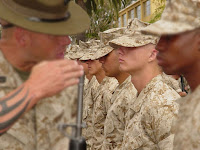
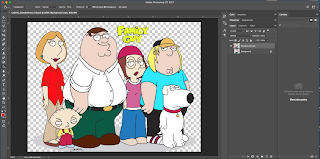
     Often images are edited to make them look nice. This can be fixing a black and white photo or making a sunset out of a cloudy day. You will see many times that images are not in their original form but edited. Lab 10 felt like it had multiple labs in it. We had 5 pictures and our job was to use editing tools in Photoshop to make them look a certain way. In short; we changed some colors in a Family Guy poster, blurred objects in an image of soldiers, fixed a black and white photo, desaturated the background of a photo, and created a sunset. These tools were the magic eraser, blur tool, dodge tool, burn tool, paint bucket tool, sponge tool, and gradient tool. The paint bucket tool filled an area with color based on the color similarity of the pixels in that area. Blur tool is self explanatory, it blurs an area of an image. Dodge lightens areas of an image while burn darkens areas of an image (both do this based on midtones, shadows, or darkness). The sponge tool saturates/desaturated areas of an image. Gradient tool, also self explanatory, creates a gradient or blend between multiple colors. The magic eraser erases parts of an image based on a range of colors.
     In Photoshop blending mode is used to determine how multiple colors will be blended into each other. For example, under normal blending mode there is a smooth transition from color to color while darker color displays a lower value of color based on the blend. The paint bucket could've been useful in my 5th lab using paint brushes. This tool would've let me color large areas more quickly. The blur tool would've been helpful in the 7th lab where I could've used it to blur the area around the turkey. I found the paint bucket best fit for me. It was very easy to use, all with a click I could change an area's color.
Before
Before
After


After (Back Blurred)
After (Front Blurred)
Before

After


Before
After

After
Before


Friday, November 17, 2017

Project 2 Reflection

     Silhouettes, you may know them as the default profile picture in social media if you have not put your own profile picture. But silhouettes are shapes, usually a person or an object, that are a solid color and have a definite outline which matches the outline of the original subject. In our second project for Visual Design we used the concept of silhouettes to make silhouette and letter tracings.
     First, we needed to find a picture of someone who inspires us. I chose 32nd US president Franklin Delano Roosevelt. We also needed to find one of their quotes, for which I chose FDR's famous "...the only thing we have to fear is fear itself..." quote. It's here the project splits. We needed to hand in two JPEGs, one of a silhouette with lettering tracing and the background one color and one where the silhouette is not one color but rather made up of at least 8 pictures that tell us about the person. In both, however, there was first making the actual silhouette of the person. To do this we fist opened a new file in photoshop and opened the picture of our person. We then selected the person using any of the selection tools. I used the polygonal lasso tool since all other selection tools got me a selection with bumpy edges. This is where the project splits up.

     For the silhouette with pictures after we selected our person we went to Select in the menu bar and clicked Inverse Selection. Then we created a vector mask for the layer with the selection. The layer went from looking like a simple picture of a person to that same picture linked with a mask that looked like a silhouette of our person. We then added at least 8 meaningful pictures. We made sure that these pictures were below the layer with the mask to make sure the pictures get cut off at the outline of our person, hence making sure it stays a silhouette.
     The 9 pictures I used were an American flag with 48 stars, a picture of the White House, the Seal of the President of the United States, a picture from D - Day in WWII, a United Nations poster from the 1940s, a poster of the New Deal CCC program, a poster of the New Deal Social Security Program, a campaign poster for FDR, and a picture with a heart with dumbbells in it. The American Flag with 48 stars is put there because FDR was an American president and when he was president there were only 48 states and 48 stars on the flag. The Seal of the President and the picture of the White House further show he was the president. The picture of the D - Day landing show that FDR had an important role during WWII. FDR had an important role in the creation of the United Nation, hence the poster of the United Nations from the time period. The New Deal was a group of American government programs that FDR used to help the country recover from The Great Depression. The CCC program was one of these programs and I put it's picture in my project to symbolize FDR's New Deal. The Social Security Program was another New Deal program which still exists today, so I included it as well. FDR's campaign poster reflected the love the American people had for him as he is the only US president to be elected 4 times. The picture of the heart with dumbbells symbolizes his strength as a leader.

     For the letter tracing after we selected our person we made a vector mask and duplicated this layer. We worked on the duplicate layer and labeled it Cutout. We right clicked on our mask and clicked Add Layer Mask to Selection. After that we right clicked and selected Delete Layer Mask. This created a cutout of our person. Next, I selected my cutout by holing the command key and clicking the picture of my cutout. I then went to the Paths tab and clicked the menu selector. I selected Make Work Path and saw a new path called Work Path. I then went back to the Layers tab, selected the Text tool,  clicked on the line of the work path, and started typing my quote. The text went around the outline. The text was initially jumbled up at a few places but by tweaking the font size and spacing of the text I got it to a state where it is readable and understandable. Then I make the entire backdrop of the picture one color and made sure that the text layer was above the color layer so it can be seen and that the text had a color that made it stand out against the backdrop.
     The quote that I chose was "So, first of all, let me assert my firm belief that the only thing we have to fear is... fear itself - nameless, unreasoning, unjustified terror which paralyzes needed efforts to convert retreat into advance." The reason why I chose this quote was it is a very well known and popular quote. It also teaches you a good lesson. That sometimes your fears can keep you from progressing and moving on to do other things.
     These skills are important for a web designer because these skills help a web designer make their work more interesting. For the silhouette with pictures we needed to use meaningful pictures that told us about the person and a lot of the pictures were symbolic of what the person was about. This skill can help a web designer use symbolism in their work. For example, if a web designer is making a logo for a phone company that has been around for a long time they may want to express that fact by incorporating a silhouette of an old fashioned phone into the design.  This makes the logo more interesting and symbolic. Perhaps a web designer wants to make and ad more interesting. If the web designer wants to put text in an ad with an object as the subject they can try putting the text around the object so that the viewers attention goes to both object and text equally. These skills overall enhance a web designer's work and make it more interesting.


Monday, November 13, 2017

Lab 9 Reflection

     The way text looks can be very important to a design. You may know of different types of fonts like Times New Roman and Arial but besides these the fonts many other things can alter have text looks. The color of the text, the outline, maybe even the textures of the text. In my 9th lab for my VD course I used Blending Options to change how text looks.


     We started off by typing our name and copying it 5 times, so we had six total copies of our name. I did extra and my first name and last name separately instead of only doing my first name. Next we used the various Layer Styles in the Blending Options to change the appearance of our name. We right clicked on the layer with our name and chose Blending Options to access the various styles. One of the Layer Styles was Bevel and Emboss creates various combinations of highlights and adds shadows to a layer. Bevel and Emboss have two sub styles, being Contour and Texture. Contour helped me change the color gradient and opacity repetitions as well as the sculpting (ridges, bumps, etc.) and shadow of the text. Texture helped me apply  texture, such as bubbles, to the text.  The other Layer Styles I used were Drop Shadow; which adds a shadow behind the text; Inner Shadow; which adds a shadow inside the text to make it look recessed; Outer and Inner Glow; which added a glow either outside the edges or inside the edges of the text; Satin; which applies and interior shading; Color, Gradient, and Pattern Overlay; which applies the layer's content with a color, gradient, or texture; and Stroke; which adds a color, gradient, or pattern outline to the text. We experimented with each of these styles chaining various setting within the styles. For example, the second Jawad from the top uses the Drop Shadow. I changed the angle of the drop shadow so that the shadow of the letters were next to the letters themselves. I also adjusted the color of the shadow to be dark blue and adjusted the shadow's distance to be further from the letters.
     These skills are important to a web designer because a web designer must know how to make the smallest of detail appealing in their work. Text may not be something that is the main subject of  a web designer's work but it must look good never the less. In advertisement a web designer may not make text the main focus but should make it blend in. If this add is for a sculpting business the wed designer may want to consider making the text look like it has a chisel effect. This will help set the theme of stone sculpting. Even for logos, where the main subject may be the text itself, you still want to make it look appealing. If this logo is for a medicine company then you don't necessarily have to apply a texture or streak to the text that sets the theme for medicine. You may want to make the text very simplistic since simple logos are very appealing even if they don't have any symbolism. So you might just want to use Arial font since that font is a very simple font. Blending Options help a web designer make their work overall more appealing and interesting.


References

Adobe Support (2017, Feb 15) Layer effects and styles. Retrived from https://helpx.adobe.com/photoshop/using/layer-effects-styles.html